Lions, birds and other animals are commonplace on the badges of Champions League clubs. But let’s face it, getting the human head right on a crest is a tough nut to crack.
So, this season, with four teams in the league phase represented by a human figure in their badge, we had to take a closer look. It’s not an easy one to pull off. When Leeds United opted for the human form on their logo a few years back, they left the head off entirely. It didn’t go down well with fans and the new look was rightly binned.
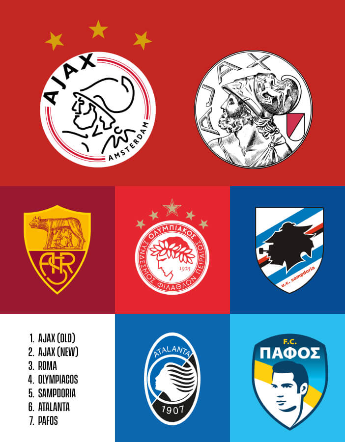
The opposite is true of the new – or should I say old – Ajax badge. If you’re going to use a human face, then a mythological Greek warrior is the place to start. Even better, this season Ajax have reverted back to an earlier incarnation of their logo from 1928 to celebrate their 125th anniversary. It’s a big improvement.
The face on the previous badge was made up of just 11 lines to represent the players on the pitch. It’s a nice idea, but it all felt a little flimsy – like a bit of clip art. A lot of football badges are very symmetrical and can feel over-designed, but the one Ajax have brought back is the opposite. It’s quirky, it feels natural. Its engraved aesthetic makes it look like a Greek coin, which feels like it’s building a story and has heritage.
This is definitely part of a trend we’re seeing in badge design. Roma also updated their crest ahead of their centenary next season, featuring a much more complex illustration and parts of an older design too. I think we’re moving away from minimalism, and bringing back an archival badge is a popular way to do that. There’s less risk involved than in designing something brand new: people already know it. A big group of fans will have fond memories of the old badge, while you’re also introducing newer supporters to the heritage.
Greece’s most successful club, Olympiacos, draw their inspiration from the Olympian ideals of Ancient Greece, and their badge has featured the profile of a laurel-crowned athlete since 1973. If I put my graphic designer hat on, maybe there are things about the execution of it that I would change, but then you might lose its charm.
My favourite badges aren’t always what I would consider the best design; they’re the ones with a strong story. I love Sampdoria’s crest, for example. It’s got the face of a Genoese sailor smoking a pipe on it, and although it’s definitely not the best-designed badge – you can’t really make out what it is until you learn the story behind it – it’s the story that makes it work. It’s the same with Olympiacos: their badge is iconic.
Our only female muse is also from Greece, but wears the black and blue of Bergamo-based club Atalanta. Atalanta was a fleet-footed huntress, which perhaps explains her flowing hair in their logo, but for me she could have been depicted in a stronger, more iconic way. Nonetheless, it’s still very recognisable; they’ve had this face on their badge since 1984. In a way, the crudeness is charming. It’s what makes it work.
To be fair, faces are really difficult to get right on a badge, and the one that probably works least for me is that of newcomers Pafos. The Cypriot club’s crest features the silhouette of Greek-Cypriot poet and revolutionary Evagoras Pallikarides.
It’s another great story, but this modern interpretation of a photo has ended up looking a bit too much like Mark Ronson or Elvis. Everything’s so clean you don’t fully capture the essence of the history behind the man, which is really interesting. I’d prefer a more stylistic interpretation – or, since we’re talking about heads, at least a nod in that direction. (I’ll get my coat.)
Lions, birds and other animals are commonplace on the badges of Champions League clubs. But let’s face it, getting the human head right on a crest is a tough nut to crack.
So, this season, with four teams in the league phase represented by a human figure in their badge, we had to take a closer look. It’s not an easy one to pull off. When Leeds United opted for the human form on their logo a few years back, they left the head off entirely. It didn’t go down well with fans and the new look was rightly binned.
The opposite is true of the new – or should I say old – Ajax badge. If you’re going to use a human face, then a mythological Greek warrior is the place to start. Even better, this season Ajax have reverted back to an earlier incarnation of their logo from 1928 to celebrate their 125th anniversary. It’s a big improvement.
The face on the previous badge was made up of just 11 lines to represent the players on the pitch. It’s a nice idea, but it all felt a little flimsy – like a bit of clip art. A lot of football badges are very symmetrical and can feel over-designed, but the one Ajax have brought back is the opposite. It’s quirky, it feels natural. Its engraved aesthetic makes it look like a Greek coin, which feels like it’s building a story and has heritage.
This is definitely part of a trend we’re seeing in badge design. Roma also updated their crest ahead of their centenary next season, featuring a much more complex illustration and parts of an older design too. I think we’re moving away from minimalism, and bringing back an archival badge is a popular way to do that. There’s less risk involved than in designing something brand new: people already know it. A big group of fans will have fond memories of the old badge, while you’re also introducing newer supporters to the heritage.
Greece’s most successful club, Olympiacos, draw their inspiration from the Olympian ideals of Ancient Greece, and their badge has featured the profile of a laurel-crowned athlete since 1973. If I put my graphic designer hat on, maybe there are things about the execution of it that I would change, but then you might lose its charm.
My favourite badges aren’t always what I would consider the best design; they’re the ones with a strong story. I love Sampdoria’s crest, for example. It’s got the face of a Genoese sailor smoking a pipe on it, and although it’s definitely not the best-designed badge – you can’t really make out what it is until you learn the story behind it – it’s the story that makes it work. It’s the same with Olympiacos: their badge is iconic.
Our only female muse is also from Greece, but wears the black and blue of Bergamo-based club Atalanta. Atalanta was a fleet-footed huntress, which perhaps explains her flowing hair in their logo, but for me she could have been depicted in a stronger, more iconic way. Nonetheless, it’s still very recognisable; they’ve had this face on their badge since 1984. In a way, the crudeness is charming. It’s what makes it work.
To be fair, faces are really difficult to get right on a badge, and the one that probably works least for me is that of newcomers Pafos. The Cypriot club’s crest features the silhouette of Greek-Cypriot poet and revolutionary Evagoras Pallikarides.
It’s another great story, but this modern interpretation of a photo has ended up looking a bit too much like Mark Ronson or Elvis. Everything’s so clean you don’t fully capture the essence of the history behind the man, which is really interesting. I’d prefer a more stylistic interpretation – or, since we’re talking about heads, at least a nod in that direction. (I’ll get my coat.)